
You ever buy something, get excited for it to arrive, open it up and immediately feel disappointed, only to spend some time with it and end up really enjoying it? If so, you have experienced what I have during my first 48 hours with the Timex Expedition Pioneer Automatic 41.
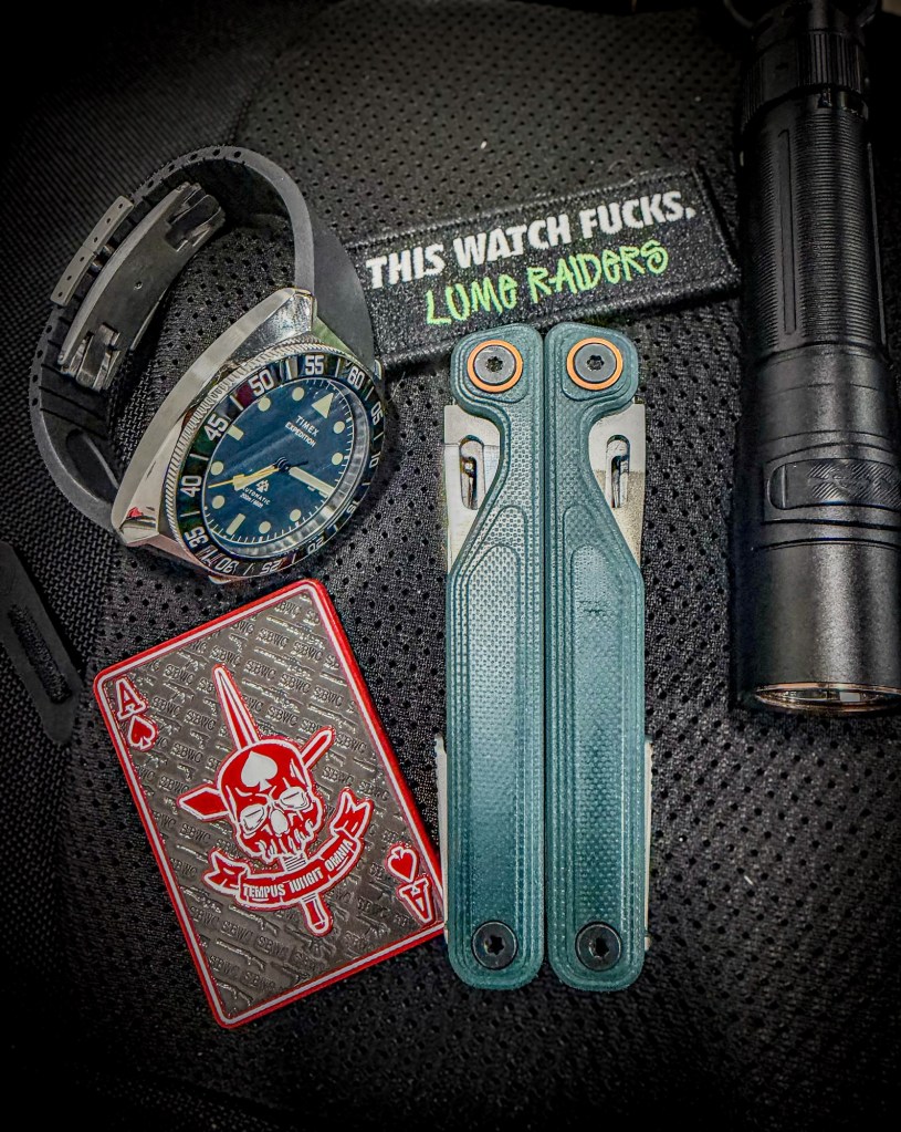
Recently I have been on a Timex kick. They have been doing some kick-ass things with their lineup and are really becoming a competitor with the big brands like Seiko and Citizen. In some ways, I think Timex is blowing those brands out of the water right now. Over the last year I have tried the Q GMT Bruce Wayne, Waterbury Vintage GMT, Deepwater Reef, Expedition North Titanium GMT, Deepwater Reef Titanium and Deepwater Meridian GMT. While putting together my initial impressions of the Meridian GMT, I did what one tends to do and kept scrolling around the Timex website. That is when I came across a newly added variant of the Expedition Pioneer.
On Timex’s website, the watch looked gorgeous. It had what appeared to be a teal dial and matching teal bezel, a brown leather strap, an automatic movement and a stainless steel case. From the first moment I saw it, the color caught my attention. That greenish-blue teal is one of my favorite colors. The shade shown online reminded me of the Cascade color of my Leatherman Wave Alpha and, to a degree, the Taiga Green of my Benchmade Bailout. It has that kind of shipwrecked coloration that I have loved on a lot of EDC gear.
Scrolling through the product page, you realize you are getting what I would describe as a field-style dive watch. That feels a little weird to say because field watches and dive watches are two distinct styles, but this is not really a traditional dive watch either. It blends elements of both. You are getting a 41mm case, 14mm listed thickness, 48mm lug-to-lug, 200 meters of water resistance, sapphire crystal, a ceramic bezel insert and a Miyota 8215 automatic movement on a 20mm brown Leather Working Group strap for $429. On paper, that is a kick-ass deal.
I was already in the process of getting rid of a bunch of watches, and after letting a few pieces go I decided another dive watch made sense—especially one that was a little different from the divers I had been wearing recently. Add to cart was clicked, the order was placed and, thanks to living relatively close to where Timex ships from, I had it within a day or two.
I waited for this one with an eagerness I do not get for a lot of products. I got the notification Wednesday morning that it was out for delivery, but by the time I had to leave for work that night it still had not arrived. That meant the next 14 hours were going to be a tease. My vehicle is currently in the shop, so my wife and I have been carpooling, with her driving me to work and picking me up. She got home from dropping me off that night and, of course, the box was sitting at the door. I asked her to bring it when she picked me up in the morning.
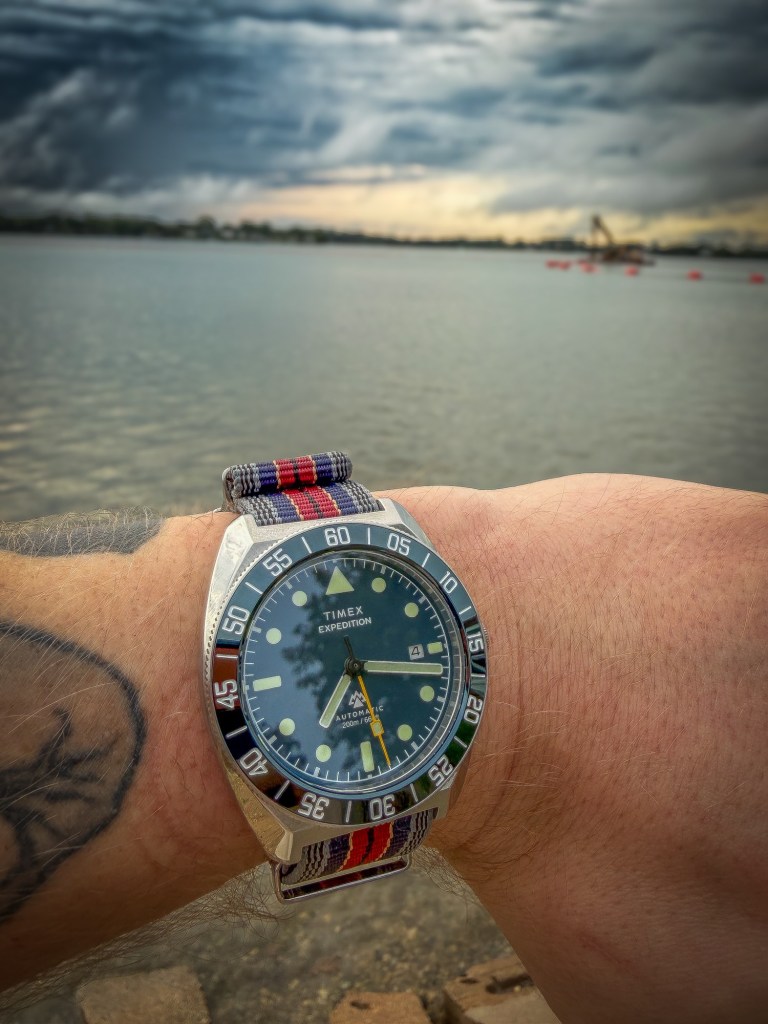
Fast forward to 6:00 AM Thursday. She pulls up to get me and, as soon as I get into the car, hands me the box. Me being the impatient person I am, I immediately open it. I am greeted by the bog-standard grey Timex box which, as I mentioned in my Deepwater Meridian article, needs to be upgraded for Timex’s more expensive products.
Then I opened the grey box and thought they had sent me the wrong watch.
The bezel looked black. It looked nothing like what was shown on Timex’s website. We drove home and I was sitting there disappointed, convinced I had received the wrong model. At the same time, I knew I was going to review it regardless. To me, an initial impression and a review start from the moment you first view a product on a company’s website. The buying experience and whether the product that arrives matches what the company represented are part of the experience.
Once we got home, I sat down with the watch, my computer and the box. I pulled up my order and Timex’s product page and compared the model number on the box with both. To my surprise, this was exactly the model I intended to purchase.
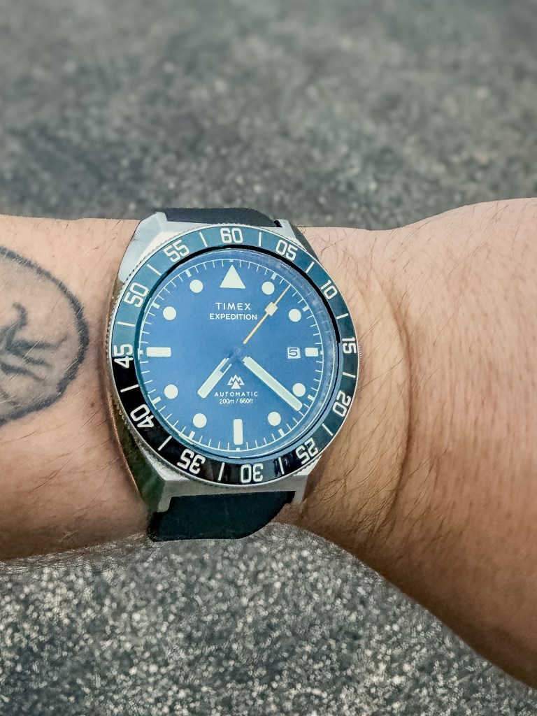
That is when I realized somebody had gotten a little overly zealous with the color sliders on Timex’s product photography. The blue-green color shown on the website is kicked way up compared with what you actually see in person. I wound the watch, set it and put it on my wrist to give it a fair shot. Under some different, non-natural lighting, I started to see that there definitely is a greenish-blue hue to the bezel. It is just far more muted than Timex’s photos would lead you to believe. In a lot of lighting, it simply looks black.
While researching to make sure I had received the correct watch, I also found other inconsistencies on Timex’s website. In one part of the listing they describe the bezel as unidirectional, while elsewhere they call it bidirectional. I will get into what the watch actually has shortly, but it is another example of something Timex needs to clean up. When you are asking more than $400 for a watch, the product page needs to accurately tell people what they are buying. Pumping out good products is great, but the website has to keep up with them.
After getting past those first issues, the actual watch started winning me over pretty quickly. The case shape is very similar to the Expedition North Titanium GMT and feels almost exactly the same on the wrist. It is comfortable and wears slightly smaller than the 41mm measurement would suggest, feeling more like a traditional 40mm watch. The weight is also right where I want it. It is not overly heavy and never gives you that feeling that you are going to get tired of having it on your wrist.
Timex lists the thickness at 14mm, but both by feel and with my calipers I am getting closer to 13.5mm. It is still a thicker watch, but it is not horrible. The case polishing is done well, although it is a little shinier than I personally prefer on a tool watch. It is still completely usable as-is.
The signed screw-down crown is what I would call petite and uses a brushed finish, which makes it look slightly out of place against such a polished case. I do really like Timex using the Expedition mountain logo on the crown, though. It looks much better than the stupid red arrow they use on the crowns of the Deepwater series.
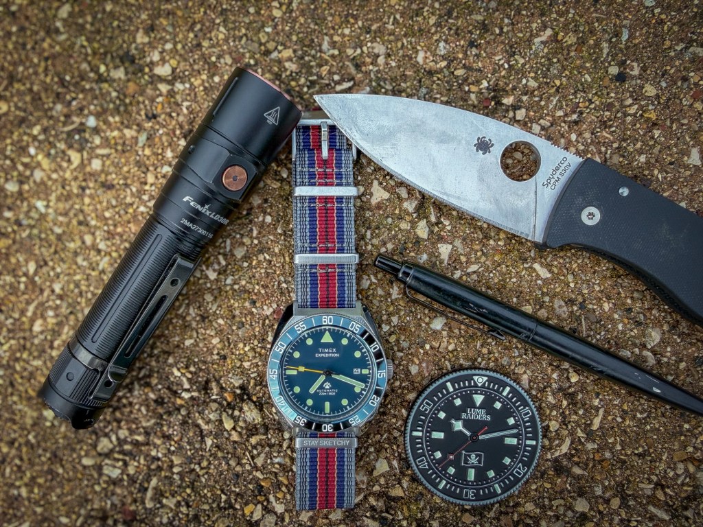
The dial itself is a nice teal and, unlike the bezel, looks pretty true to what Timex shows online. It has a matte finish without a sunray effect or anything else trying to make it look overly special. It is a pretty normal, plain-Jane dial—and on this style of watch, that works. This is a tool watch, no ifs, ands or buts about it. The Expedition name should tell you that.
At 12 o’clock you get Timex and Expedition branding. At 6 o’clock you get the Mountain Logo. “Automatic” and “200m/660ft.” This is something that disappoints me on almost any watch. Get rid of the water-resistance rating and the word Automatic. Give me just the damned mountain logo and the dial would clean up significantly.
There is a date window at 3 o’clock and, thankfully, Timex did not put a cyclops on the crystal. The applied indices look clean, the sword-style hands work well and the yellow seconds hand is a very welcome addition. That little hit of yellow stands out against the teal dial in a positive way without making the watch feel busy.
The UNIDIRECTIONAL 60-minute bezel, as I mentioned earlier, is the disappointing part when it comes to color because it looks black in most lighting. Design-wise, though, I like what Timex did. It has markings every five minutes all the way around through 60 rather than using the more traditional triangle pointer at 12. It makes the watch look a little different from what I have been wearing recently, and I welcome that change.
Ceramic was probably the right bezel material for the vast majority of buyers. This is a somewhat thicker tool watch that is likely to get knocked around, and ceramic will help prevent the scratching you get with aluminum. Personally, I still would have liked aluminum. I like how aluminum can take on the story of a watch as it gets worn, and I also think the brighter teal Timex showed online may have translated better with an aluminum insert.
Lume is acceptable. It gets plenty bright and has lasted long enough for my practical needs so far. I do wish Timex had lumed the bezel markers. That would have made the watch really stand out in the dark and added another useful element to what is clearly supposed to be a capable tool watch.
The leather strap that comes on the watch is good quality and would be perfectly fine for most people. For me, it is just a little too thick and stiff out of the box. I am sure it will break in over time, but I already have other straps I prefer. The 20mm lug width was absolutely the right choice. It is one of the most common sizes and immediately gives you a ton of options for changing the personality and function of the watch.
The sapphire crystal appears to have some type of anti-reflective coating, even though Timex does not seem to call it out. Whatever they are doing here works. The watch remains readable in direct light and in a variety of lighting situations. Again, leaving the cyclops off was the right choice. Even with the relatively small date window, I have had no problem reading it.
Around back, Timex uses a screw-down display caseback. The screw-down part is absolutely the correct choice on a 200-meter watch. The display part is where I have questions. A large logo covers the center of the display and blocks a good portion of your view of the movement. Beyond that, the Miyota 8215 is a perfectly functional movement, but it is not exactly something special or beautiful to look at. I would rather Timex have used a normal solid stainless steel screw-down caseback, potentially saved a little money and put that cost into something elsewhere on the watch that actually matters.
Overall, these first 48 hours with the Expedition Pioneer Automatic have been interesting. After opening the box, I expected to completely shit on this watch and hate it. Instead, wearing it in different places, different lighting and different situations has made me like it more and more.
It is comfortable, it genuinely looks good and even the bezel has started to become more interesting to me. The fact that it can look almost black one moment and then show those greenish-blue tones when the light hits it just right gives it a bit of character I was not expecting. I still think Timex badly misrepresented that color in the website photography, and there are questionable choices here that I want to spend more time with. Those criticisms have not gone away just because I am starting to like the watch.
But despite the flaws, the questionable decisions and the disappointing product listing, this is still a damn good piece in these first 48 hours. I am going to give it the full long-term review treatment and see where it lands after real time on the wrist. Based on how much my opinion has already changed in two days, I have a feeling the more I wear it, the more it is going to grow on me—and it may end up getting a lot more wrist time than I expected when I first opened that grey Timex box.
 Land Diver Society
Leave a comment